Clients keep asking what your studio stands for. Here is how to design a brand identity for a small business: define audience and values, build logo, palette and type from them, then write the rules down.
The order matters more than the polish. A brand identity built on clear answers about who you serve holds together across a website, a proposal and a printed card. One built on a logo alone tends to drift. This guide sorts the work by what you need to do, and each stage points to a deeper guide for readers who want more.
Choosing your route through brand design
Not every business starts from the same place, so pick the route that matches your situation and read the matching sections first. The routes below are ordered by how much groundwork is missing.
- You have an idea but no name or visuals. Settle the name before drawing anything, because the logo has to be designed around it. Read how to name a business, then continue to the foundations section below.
- You have a name but the brand feels vague. Work through the discovery questions and the mood board before touching a logo. The foundations section covers both, and you can browse brand personality examples if you are unsure how the business should come across.
- You have a logo but everything looks different. Skip ahead to the colors, fonts and style guide sections. The fix for inconsistency is documentation, not another logo.
- You are briefing a designer. Prepare your audience answers and a list of every place the brand will appear, then use the style guide section as the checklist for what the designer should hand back.
Whichever route you take, treat the brand identity as the set of things you control. Connect Media Agency describes brand identity as what you create: logo, colors, typography, packaging and tone of voice. How people feel about the business is their response to those choices, and you shape it only by being consistent.
Foundations: audience, values and a mood board
Foundational decisions come before any design file, because every visual choice later is judged against them. Skipping this stage is the most common reason a new logo gets redrawn.
Answer the discovery questions
Studio1 Design says a good designer uses a design questionnaire that asks foundational questions before any design begins. If you are designing your own brand, write the answers anyway. They become the brief you test every later choice against.
Be specific about your audience. Studio1 Design notes that a better answer than “everyone” includes gender, age, profession, geographic location and socioeconomic status. For a creative business, add the kind of client you want more of, because the identity will attract whoever it speaks to. A studio that wants editorial clients and a studio that wants small local shops should end up with different brands.
Also write down your values and voice in plain sentences. Studio1 Design says visual elements should be designed to communicate your brand’s values and voice in a consistent way, so those sentences are what the visuals have to express.
Build a mood board before you commit
A mood board lets you test direction cheaply. Big Cat Creative points out that tweaking a mood board takes minutes, compared with tweaking a whole brand. Collect imagery, textures, type samples and colors that feel right, then remove anything that contradicts your audience notes. What is left is a direction you can show a client, a collaborator or a designer.
If you have never made one, the guide What Is A Mood Board? A Practical Guide To Visualizing Ideas In 2026 walks through the method. Businesses that sell spaces can also look at Mood Board Interior Design: Create Inspiring Room Concepts Faster In 2026, since room-concept boards follow the same logic of reducing a feeling to a handful of references.
Designing the logo around strategy
A logo is a working tool for recognition, so design it for the places it has to work. Treat it as the conclusion of your foundations, not the starting point.
Tie the mark to positioning
Connect Media Agency puts the risk bluntly: a logo designed in a vacuum is just decoration. Before sketching, write one sentence on who the business serves and what makes it different. Hold every concept up to that sentence. A concept that looks good but says nothing about the sentence should be dropped, however much you like it.
Sketching on paper first keeps the options wide. Add rough shapes and lettering to your mood board and see which ideas still fit once you place them next to the audience notes.
Stress-test the mark
A good concept survives awkward conditions. Studio1 Design says the best logos also work well as a one-color logo. That is a practical test for stamps, simple print jobs and any situation where a full palette is not available. If a concept falls apart without its colors, the idea depends on decoration rather than shape.
LivePlan advises considering where the logo will appear and how easy it will be to scale to different sizes. Run the same check on your shortlist:
- Shrink it. Reduce the mark until it is a small icon on a profile or tab, and see whether it is still recognizable.
- Enlarge it. Imagine it on signage or a banner and confirm the proportions still feel right.
- Remove color. View the one-color version and decide whether it still reads as your brand.
- Place it in real layouts. Put it on a proposal cover, a social post and a letterhead, and see whether the surrounding space feels comfortable.
Choose the concept that passes the most of these tests, not the one that looks best on a blank screen.
Choosing brand colors and fonts
Brand colors and fonts should be a small, deliberate set that you can reproduce anywhere. The aim is recognition from repetition, so every extra option works against you.
Build a limited palette
Studio1 Design says it likes to use 2-3 colors most of the time and warns that a brand with too many colors will not be as memorable. Take that as a practical ceiling for everyday use rather than a rule that forbids a supporting shade now and then.
LivePlan adds a useful structure: build a system of brand colors that includes core colors and bold accents. Decide which colors do the everyday work and which are reserved for emphasis such as buttons, highlights and calls to action. Having several shades of each color gives you room for backgrounds and borders without adding new hues.
Check legibility before you commit. LivePlan recommends considering how white and black text look over each color choice. If neither reads comfortably on a color, restrict that color to non-text uses or darken or lighten it until one does.
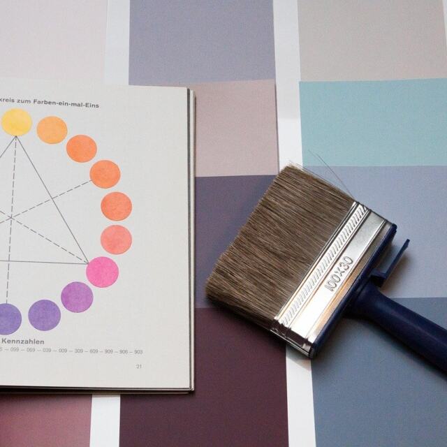
Your own preferences count too. Big Cat Creative’s design brief asks which colors you are drawn to, or not drawn to. Answer honestly, then balance your taste against what your audience will respond to. If you want to go deeper into the reasoning behind color choices, How To Use Color Theory: Practical Steps To Create Better Designs In 2026 covers the practical steps, and Color Theory In Art: A Practical Guide To Using Color Effectively In 2026 approaches it from an art perspective. If one hue is already pulling you in, Green Color Theory: A Practical 2026 Guide To Using Green In Design, Art, And Branding looks at a single color in depth, and The Best Color Theory Books: How To Pick The Right One For Design, Art, Or Photography In 2026 helps you pick further reading.

Pick type that scales
Typography has to do more than look distinctive. LivePlan recommends a font that can be adapted into multiple sizes and weights, so it can handle headers and body text without changing the overall character of the brand. A face that only works at display size will force you to bring in a second style that may not match.
Decide early which fonts carry headings and which carry running text, and keep that division consistent. If you are weighing combinations, Find The Perfect Fonts: How To Use A Font Pairing Website To Improve Your Design (2026 Guide) explains how to use a pairing tool to shortlist options. Then test your shortlist on real copy such as a service description, a price line and a contact block, rather than the sample sentence the preview supplies.
Applying design principles to your identity
Design principles are useful as a review checklist once you have a draft logo, palette and fonts. They help you explain why a layout feels off, which is more productive than saying it needs more polish.
For a broad overview, start with The 7 Timeless Principles Of Design: How To Use Them To Create More Effective Visuals In 2026. Then look at individual principles when a specific problem shows up:
- The eye lands in the wrong place. If your logo, headline and image compete, read Emphasis In Design: How To Guide Attention With 7 Core Principles and decide what should win.
- A layout feels lopsided. Design Balance Essentials: How To Create Visual Harmony In 2026 helps you diagnose why.
- Elements feel mismatched in size. Design Proportion: Essential Principles For Balanced, Harmonious Layouts (2026) addresses how parts relate to the whole.
- Everything looks the same. Use Variety In Design: How To Create Dynamic, Balanced Visuals (Practical Guide 2026) to add contrast without breaking the brand.
Apply these checks to templates, not just to the logo. A consistent template is where your identity will live most of the time, so it deserves the same scrutiny as the mark itself.
Writing the brand style guide
A brand style guide records the decisions so that anyone, including future you, can apply them without guessing. For a small creative business it can be short, but it has to be specific.
Marq advises starting with the essentials: primary logo, logo variations, color palette, typography and imagery style. The same source says to define what each element is and when to use it, so each entry needs both a description and a usage rule. A swatch with no guidance on when to use it is a sample, not a standard.

The table below turns that into a checklist you can work through. It adds the checks from the logo, color and type sections so the guide records what you actually tested.
| Component | What to define | Planning use |
|---|---|---|
| Primary logo and variations | Each version of the mark and when it applies | Note the sizes and layouts you tested, so nobody stretches the mark into a context it was not checked for. |
| Color palette | Core colors, bold accents and their shades, plus how white and black text read over each | Record which text color sits on which brand color, so legibility is not rechecked every time. |
| Typography | Fonts for headers and body, with the sizes and weights in use | Specify the font for each role, so a quick social post and a formal proposal still match. |
| Imagery style | What kind of images belong to the brand and when to use them | Add a few approved examples so collaborators can match the look. |
| Locked template elements | Logo placement and size, color palette, typography and legal disclaimers | Fix these in templates and leave only the content editable. |
| Brand decision-maker | The named person who approves exceptions | Write a name next to the standards, not a team or a vague “we”. |
The component list and the locking approach follow Marq’s brand identity guidance, and the testing notes draw on LivePlan’s branding tips.
Two points deserve extra attention. First, locking elements in templates is how a style guide becomes enforceable. Marq recommends locking the elements that define the brand, such as logo placement and size, palette, typography and legal disclaimers. Second, Marq says a clear decision-maker for brand standards is essential. Even a one-person business benefits, because the person who wrote the rules is not always the person who, in a hurry, wants to bend them.
Add a short line on tone of voice if your brand identity includes written content, since Connect Media Agency counts it among the elements you control. A paragraph on how you write and the words you avoid is enough to keep proposals, captions and replies sounding like the same business.
Taking the identity into print, web and merchandise
The identity is only finished when it works in every place it will appear. List those places before the designer finalizes anything, because they change the design decisions.
Studio1 Design says your designer needs to know where you intend to use your branding elements, such as your website, social media, flyers, merchandise, stationery and signage. Give that list to whoever builds the identity and add anything specific to your business, such as packaging or portfolio covers.
Some of those places restrict color. The same source warns that if you have signage made or shirts printed or embroidered, there may be limitations. If you plan to sell printed or embroidered goods, make sure the palette and the logo still hold up when the available colors are limited, and keep that in mind when choosing a palette.
Consistency across formats matters as much as the list itself. Marq stresses that the identity should look and feel the same whether it is a social post, a printed brochure or a proposal. The easiest way to achieve this is a small set of templates built from the locked elements in your style guide.
Business stationery is usually the first printed touchpoint, and it is where mistakes show most clearly. For decisions about what to put on a business card, including which details earn their space, read the guide on what to put on a business card. It builds on the identity decisions covered here.
Making the brand easier to trust and to sell
A brand is easier to trust when it behaves the same way every time, and easier to hand over when its rules are written down. Both outcomes follow from the steps above rather than from extra design work.
Consistency is the visible part. When a client sees the same logo, palette and tone on a proposal, a social post and a printed piece, the business reads as organized. Studio1 Design’s point that visual elements should communicate values and voice consistently is the practical test: if two pieces from your business look like different companies, the identity is not yet doing its job.
Documentation is the transferable part. A style guide with named owners and locked templates lets a freelancer, a printer or a future partner produce on-brand work without asking you about every decision. If you ever bring in outside help or hand part of the business to someone else, the guide is what lets the brand continue without you. That is a judgement about how rules reduce dependence on one person’s memory, rather than a claim about price or valuation.
Legal clearance is the protective part. LivePlan advises checking trademark databases so your potential brand name and logo are not already in use. Do that before you print, build a site or order merchandise, because changing a name or mark after launch costs far more than checking beforehand. If a database search shows a conflict, rethink the name or mark rather than hoping nobody notices.
Put together, the sequence is simple. Clarify who you serve, design a logo, palette and type that express it, test them in the places they will appear, record the rules and name an owner. A brand built that way can be explained to a client, applied by a collaborator and defended if someone copies it.
Frequently asked questions
| Question | Answer |
|---|---|
| Is a logo the same as a brand identity? | No. Marq says brand identity design goes far beyond a logo and color palette, and its examples include typography, imagery and templates. The logo is one part of a larger system. |
| Do I need Adobe Illustrator to build a brand identity? | Not necessarily. Big Cat Creative names Adobe Illustrator among the tools it uses in its branding workflow, alongside Clickup, Kit and Loom. The identity itself is the logo, colors, typography and rules, whatever software produces them. |
| Should I describe my audience as a group or as one person? | Big Cat Creative asks clients to envision a single ideal person rather than a group. A single person is easier to picture, so design decisions have a clear test. |
| When does the style guide get written? | Studio1 Design names the brand style guide phase as the fourth of five steps in its process, after the discovery questionnaire and design decisions. Write it once the core elements are settled, so it records decisions rather than guessing at them. |