A mood board interior design workflow starts with a brief, gathers images and samples broadly, then narrows to a cohesive set the client can approve before anything is bought. Digital or physical, the board is the shared reference.
Designers who also present their own studio often pair boards with a brand system. The guide on how to design a brand identity for a small business covers that side of the work.
Why a board speeds up approval
A mood board gets approval faster because it replaces verbal description with something the client can react to. The Interior Design Institute defines a mood board as a visual representation of a design concept, often used in interior design, and says it lets clients visualise the proposed design before it is implemented. A client who can see the direction can say yes, or say exactly what is wrong, early.
Milanote makes the same point from a team perspective. Its interior design moodboard template says it is important that everyone agrees on the general visual direction at the moodboard stage. Settling direction on the board costs less than correcting it once products are ordered.
The board also keeps working after approval. Instyle Deco Paris notes that a finished board provides a clear reference point when collaborating with designers or contractors. Treat it as a working document that carries the approved concept into sourcing and installation, not as a one-off collage.
What goes on a mood board
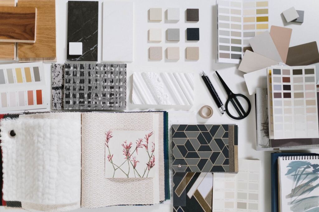
A board needs enough variety to show a style and few enough elements to stay readable. The Interior Design Institute says an interior board should blend colour palettes, textures, materials, furniture selections and inspirational imagery. Each category answers a different client question: how the room will feel, what it will be made of, and what will furnish it.
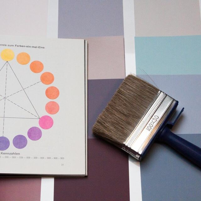
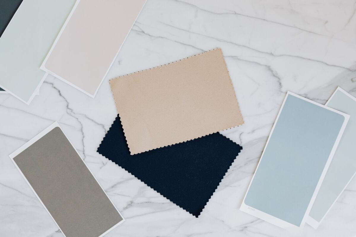
- Colour palette: include swatches or images of the specific shades under consideration for walls, furniture and accents, as Instyle Deco Paris advises. A generic colour mood tells the client less than the actual shades.
- Material samples: Mattoboard lists wood, metal, glass, fabric and stone as materials to consider. Pick the few that carry the concept rather than showing all of them.
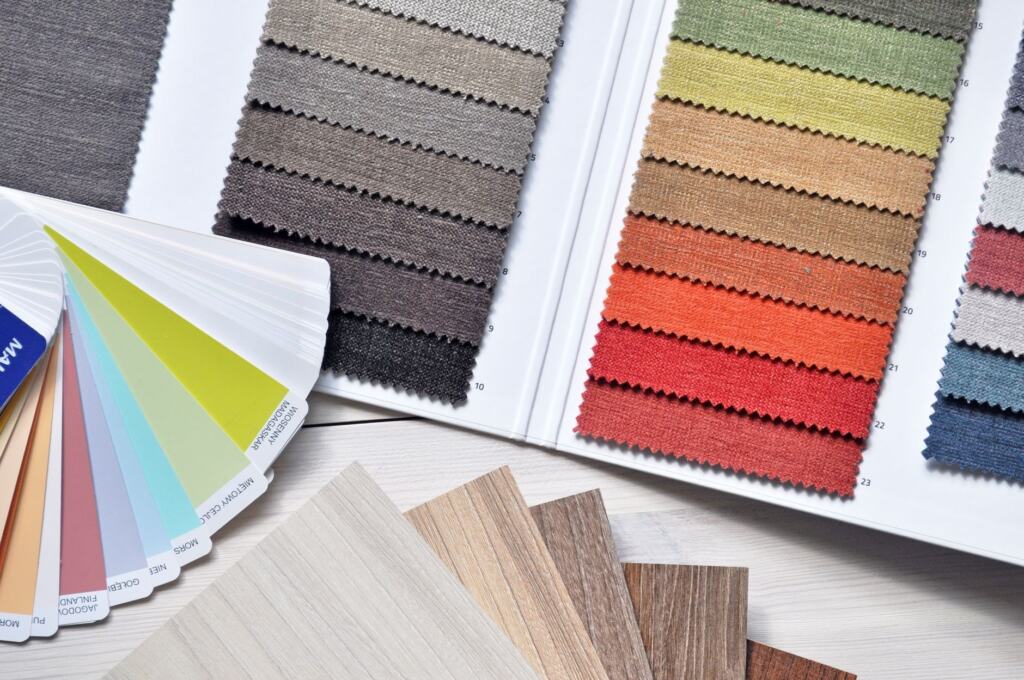
- Textures and fabrics: fabric swatches and texture samples let the client judge tactility, which flat photography cannot show. Milanote suggests dropping in product shots, on-site photography, fabric and texture samples.
- Furniture and inspiration images: product shots and room photographs show scale and style, and anchor the abstract palette to real objects.
Physical boards typically draw on magazine clippings, fabric swatches, paint chips and printed images, according to Instyle Deco Paris. Colour choices are easier to defend when they follow a logic, so Color Theory In Art: A Practical Guide To Using Color Effectively In 2026 is a useful companion when you build a palette.
Building the board step by step
The sequence matters more than the format. Each stage narrows the previous one, so the client sees a refined proposal and not a pile of options.
- Define the look and feel. Mattoboard’s first step is to define the overall look and feel you want for the space before collecting anything. A short brief with style keywords gives you a test for every image you add later.
- Collect widely, then narrow. Instyle Deco Paris advises beginning with a wide range of ideas and then narrowing the selection. Save freely at this stage and cut hard in the next.
- Place images and samples on the canvas. On a digital board, drag product shots, photos, and fabric and texture samples onto a free-form canvas, as Milanote describes. On a physical board, pin or tape the same items down and label them.
- Set the palette. Milanote suggests tools like Kuler as a starting point for colours that complement the space. It also suggests picking colours directly from the board’s images with Swatch cards, which keeps the palette tied to the imagery you already chose.
- Add a finishing material sample. Mattoboard suggests asking whether a marble or wood sample would complete the board. A real finish sample often does more than a photograph for hard surfaces.
- Share and gather feedback. Milanote encourages you to invite others to add feedback and build on your ideas. Instyle Deco Paris recommends sharing with friends, family or professionals for valuable insights.
- Refine and finalise. Remove weak options, keep the elements that fit the agreed direction, and keep a clean version for sourcing.
Choosing a digital tool
Pick a digital tool by who will use the board and how much editing skill they have. Physical boards still work, since the Interior Design Institute lists both fabric-swatch boards and digital tools such as Style Sourcebook as options. But a digital board is easier to share and revise with a remote client.
| Tool | What it offers | Planning use |
|---|---|---|
| Canva | Customisable templates designed for mood boards, with drag-and-drop | Suits designers who want a ready layout and a fast first draft |
| Milanote | Free-form canvas, a built-in library of over 3 million free photos, a Web Clipper for saving images from other sites, and a free sign-up with no time limit | Suits collecting, arranging and sharing for feedback in one place |
| Saving and organising inspirational images into boards | Suits beginners and early collecting, before a client-facing board is assembled | |
| Photoshop | Advanced editing capabilities for those with design expertise | Suits designers who already know it and want full control of the image |
| Morpholio Board and Roomstyler 3D Planner | Apps with intuitive interfaces for creating digital mood boards | Suits designers who prefer a dedicated app to a general design tool |
Tool descriptions come from Instyle Deco Paris and Milanote’s interior design template page.
For most client work, a template-led tool or a free-form canvas is the faster route, and Photoshop makes sense mainly when you already work in it. Mattoboard adds that digital boards can also be built in a Word document or with a 3D material library, so existing software is often enough.
Getting client sign-off sooner
Approval moves faster when the client reviews a board that is already focused. Present the palette, the main materials and the key furniture pieces, and keep alternates out of the first view. The board’s job at this stage is to secure agreement on direction, not to list every product.
Collect reactions on the board itself where you can. Milanote’s shared-canvas approach lets the team and client add feedback directly, which keeps comments attached to the images they concern. When the direction is agreed, the same board becomes the brief for sourcing, so nothing needs to be re-explained to suppliers or contractors.
Designers building a studio around this kind of client work also need a name clients remember. The process for how to name a business follows a similar narrowing logic, starting wide and cutting to a defensible choice.
Mistakes to avoid
The most damaging mistakes make the board unclear rather than unattractive.
- Inconsistent style: the Interior Design Institute says a consistent theme and style throughout the board ensures a cohesive and harmonious design. Instyle Deco Paris adds that conflicting aesthetics should not be mixed unless an eclectic result is the goal. If you do want eclectic, say so on the board.
- Skipping the narrowing step: a board that shows everything you collected defeats the purpose of collecting widely and then refining.
- Vague colour: a mood image without the real shades invites disagreement later. Include the specific swatches or images of the shades for walls, furniture and accents.
- Over-polishing: Mattoboard reminds designers that a mood board is just for inspiration and does not have to be perfect. Spend the saved time on the choices the client will actually respond to.
Frequently asked questions
Should I make a physical or a digital board?
Either works. The Interior Design Institute names both physical boards with fabric swatches and magazine clippings and digital tools like Style Sourcebook. A physical board lets the client handle real samples, while a digital board is easier to share and revise.
Does a mood board have to look finished?
No. Mattoboard describes the board as inspiration, and says it does not have to be perfect. What matters is that the direction is clear enough for the client to confirm or correct.
Do I need Photoshop to build one?
No. Instyle Deco Paris positions Photoshop for users with design expertise, and Mattoboard notes that a Word document or a 3D material library can also serve. A template tool or a canvas app is a simpler start.