| Green attribute | What it does | Planning use |
|---|---|---|
| Color temperature | Green is a secondary, cool color, and cool colors recede in space. | Use green for backgrounds and calm supporting areas. Give anything that must come forward a contrasting partner color. |
| Undertone | Yellow-leaning greens read warmer; blue-leaning greens read cooler. | Choose the undertone first, because it sets the temperature of the whole brand. |
| Cultural meaning | Green stands for luck in some countries and bad luck in others. | Check every target market before committing to a signature green. |
| Environmental claims | Green can make a brand look eco-friendly without any real effort behind it. | Pair green with claims the business can actually back up. |
Figures and effects above are drawn from a branding colour-psychology guide and a color-meaning guide.
Green color theory treats green as a cool color whose meaning shifts with shade, culture and context. Choose the undertone and the partner colors deliberately, and check the audience before settling on it.
Green decisions sit inside a larger system, so read this alongside our guide on how to design a brand identity for a small business.
What green means in branding
Green means different things depending on shade, audience and the claims behind it, so no single reading applies to every brand. A branding colour guide points out that color is how you create a connection with your audience, which is why a shade chosen by habit can work against a creative business.
Positive signals worth using
Green already has strong jobs in everyday visual language. Use them when they match what the business actually offers.
- Go-ahead and confirmation. Green is the go-ahead traffic signal, and many interfaces use green for confirmations and approved statuses. A booking button or a “sent” message in green feels natural for that reason.
- Restfulness. Green falls in the middle of the light spectrum and feels restful to the eye. That suits studios, workshops and learning brands that want a settled tone.
- Wealth and luck. In China, the same source describes green as the color of money and wealth, and as a lucky color. A financial or pricing message aimed at that audience can lean on it.
Risks and cultural limits
Meaning is not universal. A branding guide notes that green is linked with luck in Ireland, with life and eternity in Japan, and with bad luck in Indonesia. It can also be read as materialistic, envious and selfish.
The practical consequence is simple. A creative business selling only locally can follow local associations. A business that ships, exhibits or advertises abroad should check each market before building packaging, signage and a website around one green. If a negative reading is possible, a different hue, or green kept to a small accent, is the safer decision. The same guide also warns against using green for greenwashing, so keep the color honest by attaching it only to claims the business can support.
Choosing a shade for a creative business
The shade does most of the branding work, not the word “green”. The same branding guide explains that Monster uses lime green to show energy and vibrancy, while Jeep uses a deep olive for a rugged, prestigious feel. Both are green, and they say almost opposite things.
Green is also the most common secondary color in logos, so a generic green gives a small studio no distinction. Differentiation has to come from the specific shade and from what sits beside it.
- Lime-leaning shades. These suit brands that want energy and vibrancy, such as event, music or youth-focused work. Expect them to feel louder, so use them with restraint on large surfaces.
- Deep olive shades. These suit brands that want a rugged or prestigious feel, such as craft, heritage or premium goods.
- Yellow-leaning versus blue-leaning greens. A yellow-leaning green feels warmer and friendlier. A blue-leaning green feels cooler and more composed, so it fits calmer, more professional services.
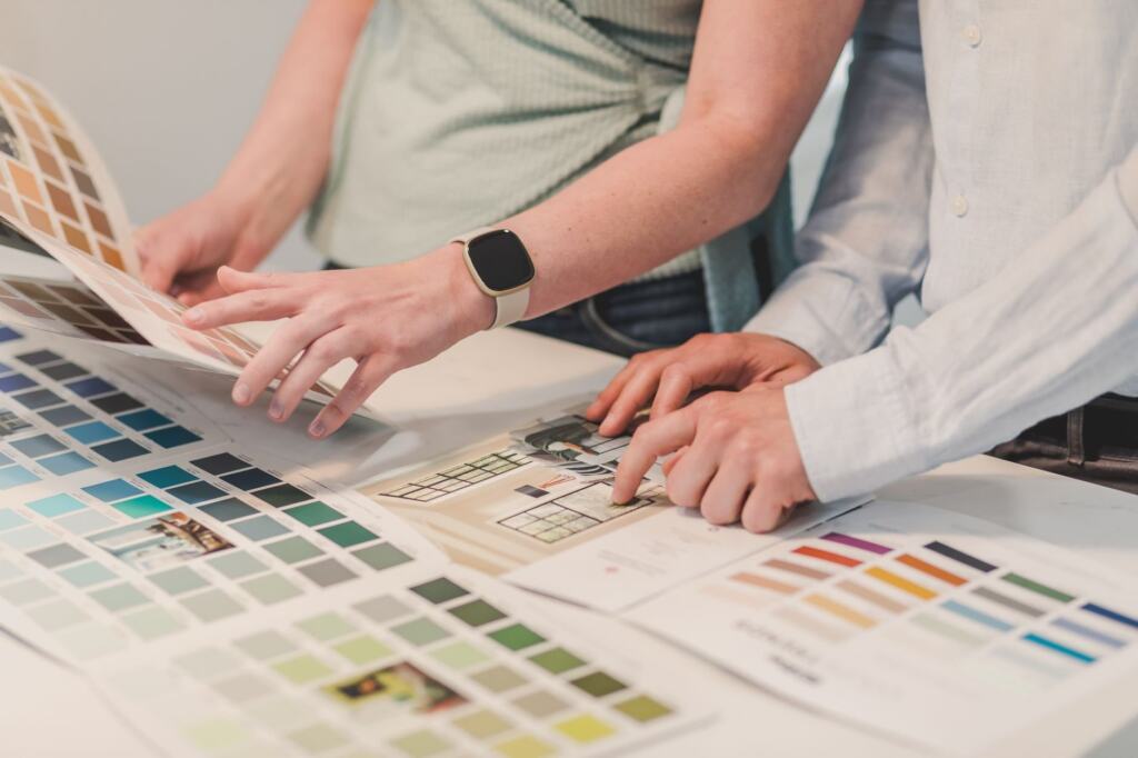
Before committing, gather candidate shades next to photography, typography and competitors. The guide What Is A Mood Board? A Practical Guide To Visualizing Ideas In 2026 explains how to do that, and it is the quickest way to see whether a shade feels like the business or just like “a green”.
Colors that pair with green
The colors that pair with green depend on how much contrast the design needs. Colors close to green on the wheel give a quiet result. Colors across from it give the most contrast. Everything between is a choice about energy.
Analogous pairings for calm
An analogous scheme uses other nearby hues on the color wheel, and nearby green hues are the obvious companions for a green base. A color-harmony cheat sheet notes that analogous colors are close together on the wheel and have little contrast. That makes them a good fit for restful, cohesive branding. They are a poor fit when a button, price or headline has to stand out on its own.
Complementary and split-complementary pairings for impact
On the traditional red-yellow-blue wheel, the complementary color of green is red. On an RGB wheel, the complement of green (#00FF00) is magenta (#FF00FF). Both facts come from a color-meaning guide, so the wheel you design on determines which opposite you reach for. The cheat sheet adds that complementary colors sit directly across from each other and have the most contrast, while split-complementary lessens that contrast.
Use a straight complement sparingly, for one element that must be noticed. Choose split-complementary when the full contrast feels too sharp for a whole page.
Triadic, tetradic and monochromatic options
- Triadic. Three colors evenly spaced in a triangle on the wheel. It gives a more varied palette, so it suits brands that want range, but it needs one dominant color to stay organized.
- Tetradic. Four colors forming a rectangle on the wheel. It has the most moving parts, so it is the hardest to keep tidy.
- Monochromatic. Variations of a single hue, as the same cheat sheet describes. It is the most controlled option and works well when a business wants green alone to carry the identity.
Building the palette
A usable palette starts from one base green and adds partners from a single harmony. A color-meaning guide describes starting from a hex shade and using harmonies to build a cohesive, balanced palette with complementary and contrasting hues. Mixing several harmonies at once usually breaks that balance.
- Calm, trust-led brands. Start with an analogous or monochromatic scheme and add contrast only where a call to action needs it.
- Action-led brands. Use a complementary partner for the single element that should win attention.
- Varied, playful brands. Try triadic, and keep green as the leading color so the palette still reads as green.
Decide early which element is allowed to stand out, then give it the partner color and nothing else. The principles behind that choice are covered in Emphasis In Design: How To Guide Attention With 7 Core Principles. Finally, test the palette in the formats the business really uses, especially text placed over green, before locking it into a style guide.
Why green behaves this way
Green behaves as it does because of where it sits on the color wheel and how the eye responds to it. In the traditional red-yellow-blue model, green is a secondary color made by mixing yellow and blue. That blend explains the undertone choice above, since adding more yellow or more blue moves the green warmer or cooler.

Perception adds a second reason to be precise. One color-psychology source says the human eye is most sensitive to green and can tell apart more shades of it than of other hues. For a brand, that means small differences between two greens are noticeable, so write the exact shade into the style guide rather than describing it loosely as “brand green”. A palette that drifts between printers, screens and suppliers will be seen.
The wheel position also drives every harmony in the earlier sections. Analogous, complementary, triadic and tetradic schemes are all measured outward from where green sits.
Frequently asked questions
Does looking at green make people more creative?
One study reported that simply looking at the color green significantly increased participants’ creativity on a puzzle task, according to a workplace-plant article. It is a single study, so treat it as a reason to experiment with green in a studio, not a guarantee.
Is green a primary color?
In the traditional model, green is secondary. A branding guide notes that it is sometimes seen as a fourth primary color, used to balance red, blue and yellow.
Why do plants look green?
Chlorophyll absorbs most red and blue light and reflects more of the green wavelengths back to our eyes, as a color-meaning guide explains.