| Technique | Effect on attention | Planning use |
|---|---|---|
| Contrast | The more items contrast, the more visible they become. | Make the headline or button differ from its surroundings in colour or shape. |
| Bold colour | Bold, contrasting colours can instantly draw the eye to a specific area. | Give the single most important item the vivid colour and keep its background dull. |
| Scale | A single large object gets noticed, and smaller details around it add depth. | Make the main image or heading the largest item and keep supporting text small. |
| Central placement | The centre of a design is the first place viewers look, and elements grow less dominant as they move away from it. | Put the key message near the centre and push secondary items outward. |
| Muted surroundings | Subtle textures and muted patterns set the stage for the feature element. | Quiet the background so the focal element stands forward. |
These effects come from interior-design guidance at Vera Iconica and from KidCourses’ notes on dominance and emphasis; the logic carries over to flat layouts.
The principles of design emphasis come down to making one element the clear focal point through contrast, scale and placement, while quieter surroundings support it. Generally one centre of interest is enough.
Emphasis is one tool within how to design a brand identity for a small business, where posters, web pages, packaging and social posts each need their own clear first read.
What emphasis means for brand materials
Emphasis is the strategic use of design elements to create a focal point. Vera Iconica describes it in interior design as a way to guide a person’s first impression toward a key element. KidCourses puts the same idea more simply: a focal point is the centre of the action. A guide to decorating makes the rule explicit: every room should have a focal point.
For a creative business, the room is a flyer, a homepage, a product label or a portfolio slide. Each one has a job, and emphasis decides which part of that job the viewer meets first. A layout without a deliberate focal point still gets a first read, but the viewer’s eye picks it by accident.
Where emphasis changes the result
The practical effect of emphasis is that people understand a piece faster. The choices below show where it matters most in everyday studio output.
Posters and event announcements
On a poster, the focal point should be whatever the viewer must remember: the event name, the offer or the main image. A large element tends to be noticed first, so size is the cheapest lever. Pair it with a quiet background so the poster does not fight itself.
Websites and landing pages
On a web page, the focal point is usually the headline or the action you want taken. Bold colour is the quickest way to mark that action, but only if the surrounding controls stay dull. If every button is vivid, none of them reads as the main one.
Logos, packaging and social posts
Small formats leave little room for several ideas. Pick one dominant element, such as the mark, the product name or a single image, and let everything else support it. Use this list to choose the lever that fits the piece:
- Choose scale when the piece is viewed quickly or at a distance and one item matters most, such as a poster title.
- Choose colour contrast when several items are similar in size and one must stand out, such as a single call-to-action button.
- Choose placement when the layout is simple and balanced, because the centre is where viewers look first.
- Choose a muted background when the focal element is already strong and the surroundings are what is getting in its way.
The cost of too many focal points
Competing emphasis weakens every element involved. The decorating guide at Southern Distinction warns that if too many areas compete for attention, none will succeed in claiming it. In brand materials this shows up as the busy homepage banner with three bold promises, or the flyer where the logo, date and photo are all the same weight.
The fix is a decision, not a technique. Rank the items by importance, give the top one the strongest treatment, and let the rest recede. Secondary items can still be visible; they just should not match the primary one in size or colour intensity. When a client insists that everything is important, show the layout in its present state and ask what a viewer would name first.
How emphasis works: contrast, scale, placement and isolation
KidCourses names three primary tools for establishing dominance: contrast, placement and isolation. Scale and colour work through those tools, because a large or vivid item is simply one that differs from its neighbours.
Contrast and colour
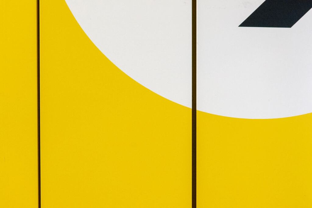
Contrast means an element is distinctly different from its surroundings. The design can set a vivid colour against a dull background, or, as in one photograph discussed on Precision Art, use circles that stand apart from rectilinear shapes in a more saturated, warmer hue. Contrast of shape and contrast of colour can work together on the same element.
Colour is the strongest of these. Southern Distinction calls it a big drawing card when it comes to claiming attention. If your palette decisions are still open, How To Use Color Theory: Practical Steps To Create Better Designs In 2026 covers how to build the palette that emphasis then draws from, and Green Color Theory: A Practical 2026 Guide To Using Green In Design, Art, And Branding is useful if your accent colour is green.
Scale and visual hierarchy
Scale is the simplest route to a visual hierarchy. Vera Iconica puts it bluntly: if an object is big, it is likely to get noticed, and the main emphasis can sit on a single large object with smaller details surrounding it. In a layout that means a dominant heading or image, then a clear step down to supporting text. Placement adds to the effect, since an element’s dominance falls as it moves away from the centre.
Isolation and muted surroundings
Isolation sets an element apart so nothing else competes with it. Muted colours, subtle textures and quiet patterns around a feature element let it stand forward, according to Vera Iconica. On a product page or a portfolio slide, that usually means a clean background and generous space around the hero item.

Technique checklist for a focal point
To create a focal point, choose the element first and the technique second. Work through the steps in this order and stop when the focal point reads clearly.
- Name the one thing. Decide the single message or action that matters most on the piece.
- Add contrast. Make that element differ from its surroundings, for example a vivid colour on a dull background.
- Raise its scale. Make it the largest item and keep the surrounding details smaller, so they add depth without competing.
- Check its placement. Keep it near the centre if the layout allows, since viewers look there first.
- Isolate it. Mute the textures and patterns around it so the feature element stands forward.
- Count the competitors. If another area is pulling the eye, reduce it, because generally one centre of interest is enough.
Change one lever at a time and look again. If adding scale already makes the focal point obvious, extra colour is likely to add noise rather than clarity.
Frequently asked questions
How is emphasis different from a focal point?
A focal point is the element that holds attention, the centre of the action. Emphasis is the set of design choices that creates it.
Which other tools can create emphasis besides contrast and scale?
Interior-design guidance lists scale, symmetry, colour, texture, contrast, patterns, lighting, furniture and architectural features. In print and screen work, texture, pattern and colour are the ones that translate most directly.
How does a large element guide the eye across a layout?
Vera Iconica describes a large artwork above a mantel or sofa as a visual anchor that also guides the viewer’s eye across the room. A large hero image or heading can play the same anchoring role on a page, with smaller details placed around it.