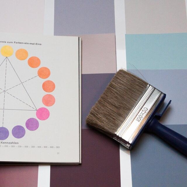
What is color theory in art answers how artists choose color to affect viewers. The phrase “what is color theory in art” guides many beginners and experienced makers alike when they need a reliable framework for decisions that otherwise feel subjective. This piece explains the core ideas clearly and gives concrete, actionable steps to practice. It covers fundamental terms, working palettes and harmonies, the psychology and cultural context of color, plus hands-on tips for painting, illustration, and digital design. Readers should finish with specific exercises, checks, and habits they can use immediately to improve composition, mood, and readability.
Key Takeaways
- Color theory in art helps artists choose and arrange colors to guide viewer attention and create mood effectively.
- Understanding core concepts like the color wheel, hue, value, and saturation is essential for mastering color theory in art.
- Using color harmonies such as complementary, analogous, triadic, and split-complementary schemes allows artists to build balanced and appealing palettes.
- The psychology of color impacts mood and symbolism, so artists must consider cultural differences and audience context when selecting colors.
- Practical application of color theory involves limiting palettes, testing value in grayscale, managing saturation to control focus, and keeping color recipes for consistency.
What Color Theory Is And Why Artists Use It
Color theory defines how colors relate and how people perceive their relationships. When artists ask what is color theory in art they seek a set of principles—both perceptual and practical—that turn subjective taste into repeatable choices. The theory combines physiological facts about vision (how we distinguish hue, value, and chroma), historical pigments and mixing practices, and modern digital color systems like RGB and CMYK. Artists use these tools to create contrast for readability, to lead the eye across a composition, to establish atmospheric depth, and to encode symbolic meaning. In practice, color theory reduces guesswork: it lets you predict whether two colors will clash, whether a highlight will read as bright at a distance, or how a palette will read under different lighting or on different devices.
Core Concepts: The Color Wheel, Hue, Value, And Saturation
The color wheel organizes hues in a circle and is the basic map artists use to find relationships quickly. Hue is the name of a color family (red, yellow, blue, etc.). Value (also called tone or lightness) is how light or dark a color appears; it is the most important factor in establishing readable shapes and three-dimensional form. Saturation (also chroma or intensity) measures purity: highly saturated colors feel vivid and forward, low-saturation colors feel muted and recede. Aside from these three dimensions, temperature (warm vs. cool) and contrast between value and saturation control perceived depth and focus. Practical exercises for beginners include making value scales for a single hue, mixing desaturated versions of a bright color with its complement, and translating a color image to grayscale to judge if the values still read clearly.
Color Harmonies And Palettes: How To Build Balanced Schemes
Color harmonies are starting rules for building palettes that feel purposeful rather than random. Artists build palettes to achieve mood, balance, or contrast while maintaining unity across a painting, illustration, or interface. A working palette typically includes: a dominant color that sets the mood, one or two supporting colors for variety, and one accent color for emphasis. You can control balance by setting dominant values (for example, mostly dark values with light accents) and by varying saturation so the accent pops without overwhelming. Palettes can be derived from nature, historical palettes, or by limiting yourself to a segment of the color wheel. Using a small, consistent palette across sketches and studies speeds decision-making and helps composition read from a distance.
Complementary, Analogous, Triadic, And Split-Complementary Schemes
Complementary schemes place opposite hues on the wheel and produce high contrast—useful for focal points and energetic compositions. Analogous schemes use neighboring hues and are excellent for harmonious, unified looks such as landscapes or background atmospheres. Triadic schemes pick three evenly spaced hues for balanced variety; they work well when you need multiple distinct elements that still relate. Split-complementary uses one hue plus two adjacent to its complement; it softens the tension of a straight complementary pair while keeping contrast. For each scheme, adjust value and saturation to avoid visual competition: for instance, pair a saturated accent with muted supports or use the complementary pair at different values to maintain legibility. Try quick studies swapping only one parameter (hue, value, or saturation) to see how the scheme’s effect changes.
Psychology Of Color: Mood, Symbolism, And Cultural Differences
Color influences mood and meaning because viewers bring learned associations, cultural context, and immediate perceptual responses. Warm colors (reds, oranges, yellows) often convey energy, warmth, or urgency; cool colors (blues, greens, violets) suggest calm, distance, or stability. However, these associations are not universal: cultural background, historical context, and specific visual systems change meaning—white is worn for weddings in some cultures and for mourning in others, red can mean luck in one culture and danger in another. Beyond symbolic meaning, color affects perceived temperature, weight, and emotional tone: a desaturated blue-gray suggests melancholy, while a bright yellow can feel optimistic or jarring depending on saturation and surrounding contrasts. When asking what is color theory in art, professionals consider audience, context, and accessibility—ensuring sufficient contrast for legibility, avoiding problematic combinations for color-blind viewers, and testing how color choices perform in different lighting conditions.
Practical Tips For Applying Color Theory In Paintings, Digital Art, And Design
Start with a clear main hue and limit the palette to three to five colors to avoid visual clutter. Test value changes in grayscale to check contrast and legibility before refining hue and saturation. Use saturation deliberately: desaturated background colors will recede and let saturated accents read as focal points. When working digitally, use color profiles, soft-proofing, and calibrated displays so on-screen colors match print or client expectations. In painting, mix small amounts of a complement to mute a color while preserving its character instead of adding neutral gray. Keep notes on color recipes and layer settings for repeatability. Practical workflows: make a thumbnail study in monochrome to lock value, then translate to color using a chosen harmony; create a swatch sheet showing each palette color at three values and two saturation levels; and simulate color-blind views or print proofs when accessibility and reproduction matter. Regular practice exercises—limited-palette studies, palette swaps on the same composition, and translating photographs to simplified harmonies—will internalize the answers to what is color theory in art and make color choices faster and more intentional.