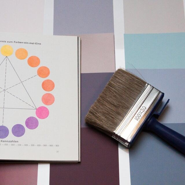
The principles of design proportion say that elements should relate to each other, and to the space around them, in a consistent, deliberate way. Pick a single ratio or grid, apply it throughout, then adjust by eye.
Proportion is one layer of visual structure, and it matters most when you are working out how to design a brand identity for a small business and need logos, type and imagery to sit together coherently.
How proportion works in a layout
Proportion is the size or quantity relationship between the parts of a design. One design education reference describes it as harmonious when a correct relationship exists between the elements with respect to size or quantity. Another definition widens the idea to the relationship between elements and between elements and spaces. In practice that means you judge a headline against the body text, an image against its column, and a block of content against the whitespace around it.
The effect follows from that relationship. Good proportion adds harmony, symmetry or balance among the parts of a design, and poor proportion removes it. A headline can be perfectly legible and still look wrong if it overwhelms the image beside it, because the fault lies in the relationship rather than in any single element.
This is why proportion works best as a set of rules you apply across a whole layout, not a per-element decision. The sections below move from the cause (the size relationship) to the tools that control it (ratios, thirds, grids) and then to the result (hierarchy and balance).
Proportion versus scale
Scale is the size of a whole object compared with another whole object, while proportion concerns the size of the parts within a composition. StudioBinder puts it directly: proportion does not refer to the overall size of a composition, but to the size of elements within it. A second reference defines scale as the relative size of an element in relation to another element or a reference point.
StudioBinder illustrates the split with Mount Rushmore. The sculpture is large compared with a viewer, which is a statement about scale. Yet the heads keep ordinary human proportion relative to one another, which is a statement about proportion. A layout works the same way: you can enlarge an entire poster without changing the relationships inside it.
The distinction affects how you fix problems. If a whole page feels too small or too large for its context, you are adjusting scale. If the page feels lopsided or crowded even at the right size, adjust the relationships between elements. Both feed the same outcome, since scale and proportion both have a place in visual hierarchy.
Ratio reference for layout work
A ratio compares two quantities directly, and designers borrow that logic to fix the relationship between two elements. The table collects the reference values most useful when you set up a layout.
| Reference | Value | Planning use |
|---|---|---|
| Simple ratio | 2 cups of water to 1 cup of rice (2:1) | Shows that a ratio fixes how much of one thing sits against another. Use the same logic to set a main content area against a supporting area. |
| Golden ratio | Approximately 1:1.618, built by adding the two previous numbers | A starting point for the relationship between an image and its neighbour, or between a column and its sidebar. Test it visually before committing. |
| Golden ratio modular scale | Multiply or divide by 1.618 for the next value up or down | Generates a family of related sizes for type, spacing or image widths. |
| Classic typographic scale | 6, 12, 24, 48, 96 (each step doubles) | A simpler, more dramatic alternative to the golden ratio when you want clearly separated sizes. |
These values come from the Compass of Design discussion of scale and proportion.
Using the golden ratio
The golden ratio sequence is approximately 1:1.618, and it can be described as adding the two previous numbers to get the current number. To use it, choose a base size, such as your body text size, then multiply by 1.618 to get the next size up and divide by 1.618 to get the next size down. Stop when the sizes cover the roles you need, usually body, subheading and headline.
The golden ratio suits layouts where you need a clear relationship between a dominant and a supporting element, such as a hero image and a text column. Treat it as a starting proportion, not a verdict. If the result looks wrong on the actual screen or sheet, change the values until it reads correctly. The ratio gives you a defensible first guess and a reason for your choices, and your eye does the final check.
Choosing between a golden scale and a doubling scale
The 1.618 multiplier gives gentler steps, so it suits designs that need subtle differences between levels, such as a dense article page. A doubling scale like 6, 12, 24, 48, 96 produces sharply separated sizes, which suits posters and presentation slides where a headline must dominate. Pick one scale per project and keep to it. Mixing both makes the relationships between sizes hard to see.
Rule of thirds for focal placement
The rule of thirds is a composition aid that, like the golden ratio, helps you reach harmony. One design reference lists both as ways to create balanced proportions, such as using the golden ratio or the rule of thirds. It works by dividing a frame into equal parts in each direction and placing the subject along those dividing lines or where they cross, instead of in the dead centre.
Use it for photographs, hero banners and poster artwork where one subject needs to carry the composition. It helps most when the image has a clear focal point and a horizon or strong edge, because those features can sit on a grid line. It helps less when the layout is dense with text, where a column structure usually does more work.

When you crop an image for a layout, check where the focal point lands before you check anything else. A subject pushed to one side leaves room for headline text on the other, which also makes the text and image feel planned together.
Modular grids and consistent margins
A modular grid divides a page into repeating cells, and every element then aligns to those cells. The most practical guidance on this comes from the principle of using the same proportion for margins, grids, or columns to achieve unity and cohesion. The point is repetition: when margins, gutters and columns share a proportional logic, the page feels organised even before a reader notices why.
A grid also gives you a set of allowed sizes. An image can span a whole number of cells, a text block can span another, and nothing sits at an arbitrary width. You can combine this with a type scale: base the type sizes on the same multiplier as your spacing, and the page keeps one proportional voice from headline to margin.
Choose a modular grid when you have many pages or components that must look related, such as a website template or a multi-page brochure. For a single poster with one dominant image, thirds or a golden ratio split is usually quicker and gives a more dramatic result.
Proportion, hierarchy and visual balance
Hierarchy is linked to the relative importance of elements in the design, and proportion is how you express that importance in size. The element that matters most gets the largest share of the space, and supporting elements step down in a consistent pattern. Reading order then follows size without any instruction.
Larger elements carry more visual weight, so balance depends on what you set against them. A big image can be balanced with a cluster of smaller items or with generous whitespace, and the choice changes the mood: whitespace feels calmer, while a cluster feels busier. Keep the spacing between related items proportional to each other so groups read as single units.
Proportion also needs contrast to avoid monotony. If every element follows the same ratio and the same size, the layout is orderly but flat. For ways to add energy without losing coherence, see the guide to Variety In Design: How To Create Dynamic, Balanced Visuals (Practical Guide 2026). For how proportion sits alongside emphasis, balance and the other core ideas, read The 7 Timeless Principles Of Design: How To Use Them To Create More Effective Visuals In 2026.
Applying proportion step by step
- Rank the content. Decide which element must be seen first, which comes second and which is supporting. Proportion has to express this order, so settle it before you choose any ratio.
- Choose a single system. Pick the golden ratio, a doubling scale or a modular grid as your base. Add thirds only for image placement.
- Set the sizes from the system. Derive type sizes, image widths and spacing from the same multiplier or grid so they stay related.
- Apply the same proportion to margins and columns. Shared logic across margins, grids and columns is what produces unity.
- Check the whole, then the parts. Look at overall scale first, then at relationships. A layout that is the right size can still be out of proportion, and the fix differs.
- Adjust by eye and record the rules. Treat the ratio as a guide, change values that look wrong, and write down the final rules so other people can reproduce the balance.
Common pitfalls
- Treating a ratio as a law. The golden ratio gives a relationship, not a guarantee. If a layout looks wrong at 1.618, the layout wins.
- Confusing scale with proportion. Enlarging everything keeps relationships intact, so it will not repair a layout whose parts are mismatched.
- Mixing several systems. A doubling type scale on a golden-ratio grid obscures the logic and makes later edits harder.
- Applying thirds to text-heavy pages. Thirds help with focal points, but body copy needs columns and consistent margins.
- Inconsistent spacing. Margins and gutters that follow no proportion undermine an otherwise careful size system.
Frequently asked questions
What is proportion in design?
It is the size or quantity relationship among the elements of a design, and between those elements and the space around them. Good proportion produces harmony and balance across the parts of a layout.
How do I use the golden ratio?
Take a base size, multiply by 1.618 for the next size up, and divide by 1.618 for the next size down. Use the resulting values for type, columns or image widths, then check them visually and adjust where they look wrong.
How does proportion differ from scale?
Scale compares the size of one whole object with another, or with a reference point. Proportion concerns the sizes of elements within a composition relative to each other, so you can change scale without changing proportion.
Which proportion tool should I learn first?
Start with the modular grid if you build repeatable layouts, because shared margins, columns and grids create cohesion. Add the golden ratio for sizing and the rule of thirds for image placement once the grid is in place.