How to use color theory in practice: read the color wheel, pick a harmony, build a small palette around your brand’s dominant color, then check value contrast so text stays readable.
Color theory is a set of relationships, not a list of approved colors, so every step below ties a choice back to brand decisions. For the wider picture, see how to design a brand identity for a small business, where color is one decision among several.
The color wheel as a working tool
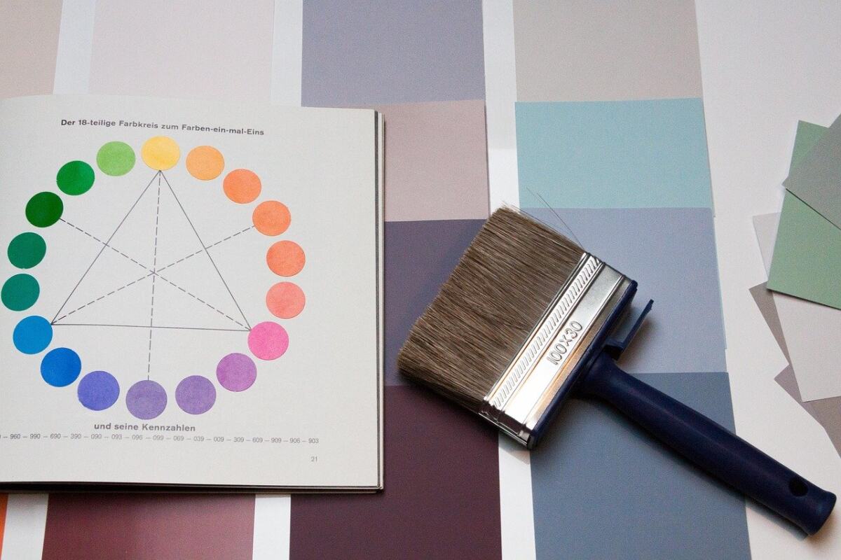
The color wheel is the map every other step relies on. According to Sessions College, it is divided into 12 segments, with the primary colors red, blue and yellow equally spaced apart. Mixing two primaries gives a secondary color: blue plus yellow gives green. The Interaction Design Foundation describes the same wheel as 12 main colors, made up of primary, secondary and tertiary hues.
For a designer, the wheel’s main job is to turn a vague preference such as “something fresh” into a position and a set of neighbors. You choose where a color sits, then use geometry to find companions: next to it, across from it, or evenly spaced around it. That is faster and more consistent than picking swatches one at a time, and it gives a team a shared vocabulary when they discuss a brand color.
The wheel only tells you about hue. Lightness and intensity are separate decisions, covered under palettes and contrast below. A wheel-perfect pairing can still fail on a page if both colors are equally light or equally dull.
Choosing a color harmony
Color harmony, in the Interaction Design Foundation’s definition, is the balanced and aesthetically pleasing interaction of colors. The same source lays out 7 schemes as a guide for choosing harmonious colors. Four of them cover most small-business work, and the choice depends on how much energy and variety the brand needs.
| Scheme | How the colors are chosen | Planning use |
|---|---|---|
| Monochromatic | Different versions of the same color, giving a unified and elegant look | Suits brands that want one clear voice; plan lighter and darker versions so the page still has hierarchy |
| Analogous | Three adjacent colors on the wheel | Suits a brand with a dominant mood; pick one color to lead so the neighbors support it |
| Complementary | Colors on opposite sides of the wheel, such as purple and yellow | Suits brands that need a strong accent against a base; use the second color sparingly |
| Triadic | Three colors evenly spaced around the wheel, such as red, yellow and blue | Suits playful brands with varied content; let one color dominate and the others punctuate |
Scheme definitions follow the Interaction Design Foundation and Sessions College.
Complementary schemes are the most dramatic option. One design school explains that pairing a cool and a warm color together helps create color contrast, which is why a complementary accent draws the eye so quickly. Choose it when you want one element, such as a call to action, to stand apart. Choose a monochromatic or analogous scheme when the design needs to feel quiet and consistent.
Harmony is also a layout matter, not only a color matter. The way colors are distributed across a page affects how settled it feels, which is the subject of Design Balance Essentials: How To Create Visual Harmony In 2026.
Building a palette around brand decisions
A palette is the working set of colors a brand actually uses. Build it in this order so each choice has a reason behind it.
- Choose the dominant color first. The Interaction Design Foundation says this color should align with brand ethos and target user group. If you cannot say why the color suits both, keep looking before adding anything else.
- Start with a simple scheme. The same guide advises beginning with a simple scheme and checking whether it fits the design needs before adding more colors. A tight palette is easier to apply consistently across a logo, a website and printed material.
- Set the saturation range. Saturation can run from fully saturated (vibrant) to desaturated (grayed). A vibrant brand color works for accents and calls to action; a grayed version is easier on large areas. Decide which role each color plays before you finalize it.
- Extend with lighter and darker versions. Monochromatic palettes consist of shades and tints of a single hue, and a tint is made by adding white to a pure hue. This gives a brand more working colors without adding new hues.

Treat the palette as a decision tool, not a decoration. Each color should have a job: the dominant color carries recognition, a contrasting color marks what matters, and lighter or darker versions handle backgrounds and text. How a dominant color steers the viewer’s eye is covered in Emphasis In Design: How To Guide Attention With 7 Core Principles.
Checking value, contrast and accessibility
Value is the lightness or darkness of a color, and it does more work than hue when readers scan a page. The Interaction Design Foundation notes that value is essential to establish contrast and depth. Zollie Makes adds a warning: if you choose all colors with a similar value, even if they are different hues, they will look muddy. A palette that looks lively as swatches can therefore flatten into one gray mass on the page.
The quickest way to check this is the grayscale test. Take a screenshot or photo of the design and convert it to grayscale. If the elements still separate into light and dark areas, the value contrast is working; if they blur together, adjust the lightness of one color rather than changing its hue.

For accessibility, the principle is plain: text with high contrast against its background vastly improves readability. The same source advises pairing contrasting colors for important functionality and content, so that readability and visual guidance hold up. In practice, that means body text, buttons and form labels should get the strongest contrast in the palette, while decorative elements can be subtler.
The grayscale test is a fast first pass, not a formal audit. For a final decision on a specific text and background pair, measure it with a contrast-checking tool and follow whatever accessibility standard your project is required to meet.
Applying the palette to a layout
Test the palette on real screens and real content before locking it. Swatches in isolation hide problems that appear once a color sits behind a paragraph or beside a photograph.
- Backgrounds and text: keep these in the lightest and darkest neutrals so reading never depends on a vivid hue.
- The dominant brand color: use it where recognition matters, such as the logo, headers and key graphics, rather than as a fill for every surface.
- Contrasting accents: reserve them for the actions you most want taken, since an accent loses force the more often it appears.
- Added colors: introduce them one at a time, and only when the existing set cannot do the job.
When a layout feels off, diagnose it in order: check value contrast first, then saturation, then hue. Most fixes are lightness adjustments, and they keep the brand’s chosen hues intact.
Frequently asked questions
Do colors mean the same thing to every audience?
No. The Interaction Design Foundation advises keeping users’ cultural color-related attitudes and perceptions in mind, so check how your main colors read for the audiences you serve before committing to them.
Which colors count as warm and which as cool?
On the Interaction Design Foundation’s wheel, yellow to red-purple are warm colors, while purple to green-yellow are cool. Knowing which side a color falls on helps you decide what mood the dominant color sets.
How do I make highlights and shadows from a base color?
Use a tint for highlights and a shade for shadows. A tint adds white to a pure hue, so highlights are generally created with the tint of the color; a shade moves the other way, toward darker.