Quick answer: what to put on a business card comes down to your name, a specific job title, your logo and website, and a contact detail you actually answer. Add extras like an event reminder only if they help a buyer remember you.
A card is one piece of a wider identity, so it helps to settle how to design a brand identity for a small business before you send anything to print. The sections below cover content, layout, paper stock and the stationery that goes with the card.
Core content to print
A creative card needs to identify you, say what you do and give a buyer an easy way to reach you. United Graphics lists the standard content as the company logo, company name and tagline (if any), company website, your name, job title and contact details. Treat that as the baseline, then adjust it to the way you sell.
Name and job title
Your name comes first, and a nickname is acceptable when people know you by it. The same guidance suggests using the popular nickname you go by, such as Jon instead of Jonathan, so the name on the card matches what buyers will say and search.
Make the job title specific. United Graphics advises thinking about what a client might hire you to do, such as graphic design or marketing consulting, rather than a generic label. For a maker, that means naming the craft or service (ceramics, illustration, brand photography) instead of “Founder”. If the business name itself is still undecided, work through how to name a business first, because a name change after printing wastes the whole run.
Contact details
Choose the channels you will really monitor. A personal number or email can help a card stand out from competitors, according to the United Graphics guidance, which also warns that too much unnecessary contact information can detract from the overall design. Practical rule: print the website plus one direct way to reach you, and add a third channel only when buyers genuinely use it.
Logo, company name and website
The logo and company name tie the card to everything else you produce. If your tone is still unclear, looking at brand personality examples can help you decide whether the card should feel playful, refined or understated before you commit to type and colour. The website matters because it carries what a card cannot: your portfolio, prices and full range.
Choosing a layout and approach
The right layout depends on how much a buyer needs to know at the moment of handover and how much you want the web to do. The options below cover the common choices.
| Approach | What it looks like | Planning use |
|---|---|---|
| Logo and contact split | Logo on one side, contact information on the other | The safest default. It is timeless and easy to read, and it suits makers who want the work to speak through the logo. |
| Name only | Your name with no contact details | Works only if people will find you by searching your name online. |
| Private and public versions | Two variants: one with personal numbers, one without | Useful when you want to hand your direct number only to serious buyers and keep the public card lighter. |
| Event reminder | Wording that records where you met | Suits conferences and fairs, where recipients collect many cards and need a prompt to remember you. |
| Offer card | A coupon or promotion on the card | Business cards can also carry a coupon or promotion. |
Layout options come from Vermillion Silk’s business card ideas, with the advice on limiting contact details from United Graphics.
Cards for markets and events
At a market stall, the card is what a buyer takes home after the conversation, so it should answer “who made this and where do I find more?” at a glance. The simple split layout, with the logo on one side and contact information on the other, suits a stall because nothing competes for attention while a stranger decides whether to keep it.
Wording about where you met can help recipients remember you after an event, according to Vermillion Silk. The same page notes that owners often keep two versions of their card. For makers, that points to a practical split: a public version for the stall counter and a private version with a personal number for repeat buyers, commissions and trade enquiries.
Put the handover in your routine rather than leaving cards in a stack. Give a card when a conversation ends, and mention the website so the printed piece and the online portfolio reinforce each other.
Paper stock and finishes
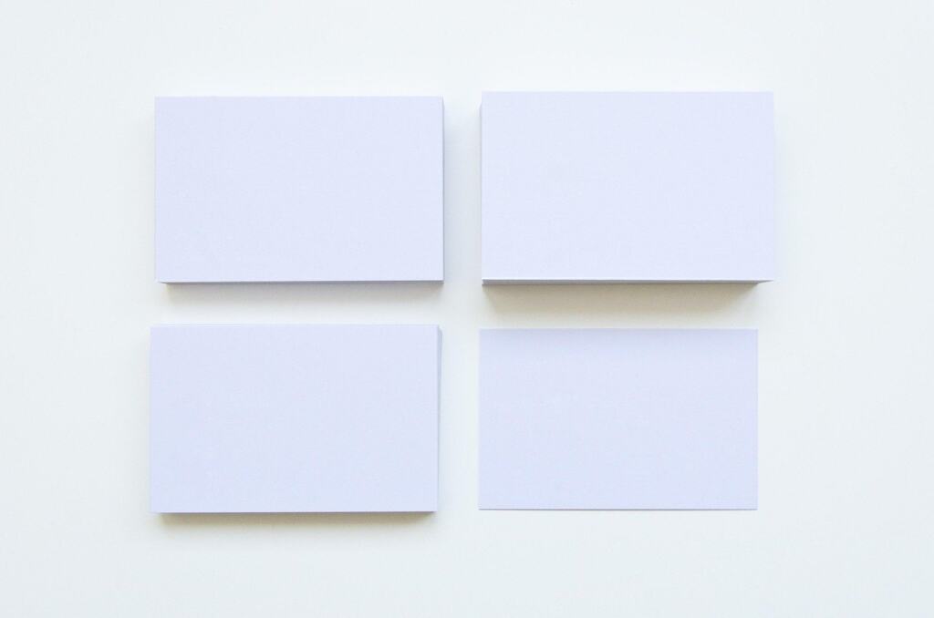
Paper stock is the part of the card a buyer feels, so choose it to match the work you sell. A printer can usually explain the options in its range, and a vendor’s own description is the best guide to how a particular stock behaves.
Vermillion Silk, which describes itself as a luxury business card printing service, says its silk cards go through a special lamination process that creates a rich, silky smooth matte texture. It also states that its silk and suede cards can both be written on with most pens. A writable finish matters at a market, where you may want to add a note, a price or a date by hand.
Premium additions
The same vendor lists foil stamping, die cut corners and spot UV gloss as additions to a silk card order. These suit makers whose products are tactile or luxury-led, where the card is part of the impression. For a stall selling affordable work, a clean matte card with good typography is usually a better use of budget than several finishes together, and you can add a single detail such as spot UV on the logo if you want one touch of polish.
Printed stationery beyond the card
Printed stationery is worth having when you deal with buyers after the first meeting. Traditional business cards remain an effective way to promote you and your company, according to United Graphics, so the card is the one printed piece to prioritise.
Beyond the card, extras such as a thank-you card or an invoice template are optional. Add them as orders and repeat customers appear. The simplest way to keep a set coherent is to reuse the same logo, name and contact details that appear on the card, so every piece a buyer receives looks like it came from the same business.

Common problems and fixes
- The card feels crowded. Remove contact channels you rarely use. Excess contact information can detract from the design, so keep the website and one direct channel.
- Buyers forget where they met you. Add short event wording to the card used at that fair or conference, rather than reprinting your whole identity.
- You do not want strangers to have your personal number. Print a public version without it and keep a private version for people you trust.
- The job title says nothing. Replace a generic title with the work a client would hire you for.
- You need to add details by hand. Choose a writable stock such as silk or suede from a vendor that states pens will work on it.
Frequently asked questions
Should I use a nickname on my card?
Yes, if it is the name people actually use for you. United Graphics suggests including the popular nickname you go by, such as Jon instead of Jonathan.
Can a business card carry an offer?
Yes. Vermillion Silk notes that business cards can also include a coupon or promotion, which can give a recipient a reason to visit your website or stall again.
Do I need foil or spot UV?
No. Foil stamping, die cut corners and spot UV gloss are optional extras offered on premium silk cards. A clear layout and readable contact details matter more than finish.
How many cards should I print for an event?
Vermillion Silk mentions event-specific orders of a few hundred cards for conference networking. Match your order to the event you are attending and use event wording only on that batch.