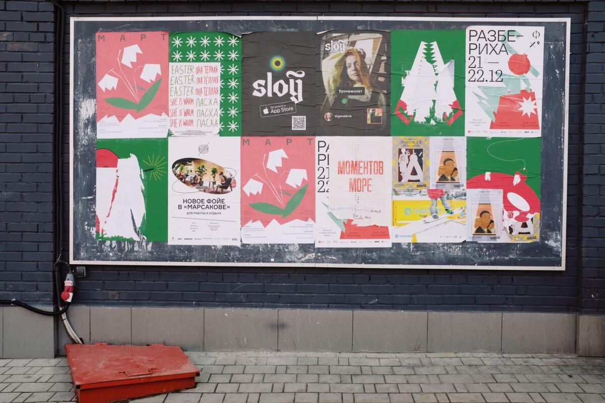
A brand poster looks tidy but dull, so someone piles on extra fonts and colours and it turns chaotic. The principles of design variety resolve this: add difference on purpose, and keep a shared thread running through it.
Variety is one decision inside a larger visual system. For the wider picture, read how to design a brand identity for a small business, then come back here for the detail on difference.
What variety means in practice
Variety in design means difference. A course text from Prince George’s Community College puts it plainly: variety refers to difference, and it is hard to understand what is the same unless differences can be seen. A broader design reference describes variety as a principle that embraces diversity of structure, rules, look and feel.
The purpose is practical. The BBC’s GCSE art revision material says variety is needed to create interest and to prevent a work from being dull or monotonous. The same guide gives unity the opposite job: it makes a composition appear as one unified work rather than separate elements. A layout needs both, and most mistakes come from treating them as rivals.
| Common belief | What the evidence supports | Planning use |
|---|---|---|
| Variety means anything goes | Variety is difference, and difference only reads against something that stays the same | Decide which attributes change and which stay fixed before designing |
| Unity means everything matches | Unity is a sense of oneness or cohesion, and visual unity comes from similar visual elements | Repeat some elements and let others differ |
| Variety and unity pull in opposite directions | Variety prevents dullness while unity stops a composition falling into separate elements | Check a layout for both, not for one at the expense of the other |
| Variety comes only from contrast | The BBC guide lists contrast, difference and change, and elaboration as ways to create variety | Choose the method that fits the job instead of defaulting to loud contrast |
The definitions come from the Prince George’s Community College course text and the BBC Bitesize revision guide for AQA GCSE art.
Misconceptions that weaken layouts
Most weak layouts do not lack ideas. They rest on a wrong picture of what variety and unity ask of a designer.
Variety is not randomness
Random difference gives the eye nothing to compare. Because difference only registers against sameness, every varied layout needs a stable base: a palette, a recurring shape or a consistent arrangement. Pick that base first, then let the remaining attributes move.
Unity is not sameness
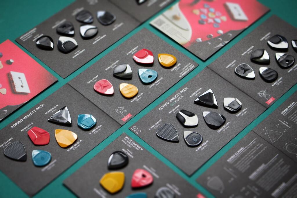
Visual unity uses similar elements to form a cohesive whole, which is not the same as using identical ones. A presentation on the principles of design states the pairing neatly: repetition creates order while variety prevents monotony. Repeat the colour, the shape or the spacing, and let size, position or detail differ around it.
Monotony is a failure too
Designers who fear chaos often swing to uniformity. A page where every block is the same size, weight and colour is safe, but nothing in it tells the viewer where to start. If a layout feels flat, add a small amount of difference before adding a large amount.

Adding variety without losing unity
The safest approach is to fix the unifying elements first and then introduce difference one lever at a time. The steps below follow that order.
- Set the shared thread. A design reference notes that dissimilar elements can be tied together with a theme, and a colour scheme can do that job. In Johns’ Target (1958), the course text points out that all the primary colours are used and a circle supplies a repeated shape that ties the variety into unity. For brand work, the equivalent is a defined colour palette and a signature shape.
- Repeat, then vary one aspect. The BBC guide describes difference and change as repeating similar elements but varying one aspect, such as size, colour or position. Size relationships are the easiest aspect to get wrong, and the guide Design Proportion: Essential Principles For Balanced, Harmonious Layouts (2026) covers them in more depth.
- Use contrast where attention matters. Contrast means using shapes, forms, colour, texture or other elements that are very different from each other, and the BBC guide ties it to dynamic work. Reserve it for the element you want seen first, so it keeps its force.
- Add detail where viewers should linger. Elaboration adds detail and complexity that gives the viewer more to look at. It suits a hero image or an illustration, not a navigation bar or a form.
- Treat type as a variety lever with limits. Headline and body text can differ in a way that still feels related. For help choosing faces that sit together, see Find The Perfect Fonts: How To Use A Font Pairing Website To Improve Your Design (2026 Guide).
Variety and unity are compatible: the design reference states that there is nothing inconsistent between them, and that designs can achieve unity with variety.
Variety as a tool for brand visuals
For a brand, variety is what keeps a set of assets from looking like a template, and unity is what makes them recognisably yours. The practical move is to separate the fixed parts of the identity from the flexible ones, then write that split down so everyone designing for the brand can follow it.
- Fixed: the colour palette and a recurring shape. These work like the colour scheme and circle in Johns’ Target, carrying unity across every asset.
- Flexible: size, position and the amount of detail. These are the aspects the BBC guide suggests varying while similar elements repeat.
- Before: every item shares the same size, colour and position. The result is orderly and dull, which is the monotony the BBC guide warns against.
- After: the same items keep their shared palette and shape, but one aspect changes from item to item. The result gives the eye a route through the layout without breaking the set.
This split also helps when several people contribute to the same brand. Anyone can add a new asset by changing a flexible attribute, and nobody needs to guess which choices are open.
Common mistakes to check before sign-off
- Every element competes. If everything differs by the same amount, no element leads. Emphasis draws the eye to certain elements, so pick the one that should come first and let its difference be the strongest. This gives the layout a visual hierarchy.
- No repeated anchor. A layout with no shared palette, shape or arrangement can read as unrelated pieces. Name the repeating element before judging how much variety to add.
- Flatness mistaken for polish. Removing difference to look clean can leave a design that fails the basic job variety has: creating interest.
- Changing too many aspects at once. Varying one aspect at a time makes it clear what the difference is for and makes the result easier to evaluate.
Frequently asked questions
| Question | Answer |
|---|---|
| What is Gestalt unity? | The course text describes Gestalt unity as a combination of conceptual and visual unity. Visual unity comes from similar elements, while conceptual unity comes from the idea that holds the work together. |
| Does variety have to be bold? | No. A design reference describes structural variety as patterns that are complex or slightly irregular, which can add interest without loud contrast. |
| How can I tell if a varied layout still holds together? | Look past the first impression. The course text notes that in a Pollock painting nothing appears similar at first glance, yet a closer reading reveals shared colours and line types. If you can find such shared threads in your own layout, it has unity. |